This is cool charts #5.
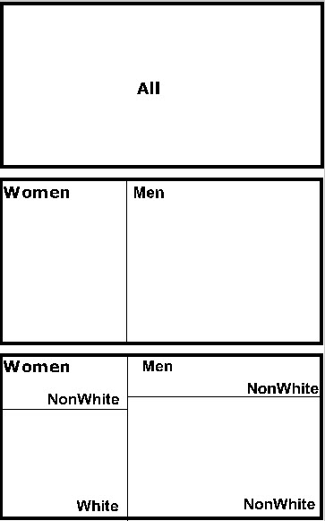
Mosaic plots are rectangular plots composed of smaller rectangles typically used to display measures of counts or sums of a scale level variable for 2 or more categories. The area of the rectangle is proportional to the category’s proportion of the whole. There are no data dimensions defining the axes. Here’s a simple example. Assume that you have counts by gender for a study of 100 people. The simple frequencies for gender are 40 females and 60 males with two rectangles. Then we divide each rectangle up into the proportion of whites and nonwhites within each gender to create a mosaic plot with 4 rectangles:

In this example there is a simple cross of two dimensions: gender and race. The chart could easily be configured so that the first split starts with race and the second split by gender. But we could have a semantically nested design in which it makes no sense to split by town, and then state.
Our example is simple: two categories of gender>two categories of race to create four rectangles.
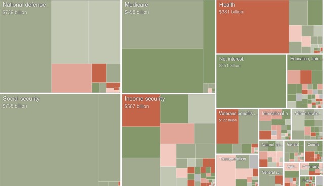
Here is a example which displays the proposed 2011 Federal Budget in 2010. (Note that that budget was never passed and the administration is currently revising it to present to Congress this month).
We start with 5 major categories for the budget: national defense, social security, medicare, income security, health, and then a large set of additional categories: health, interest, education, etc. Within the hierarchy, are the top level categories and are separated by large white margins. Next come second and third level categories which are nested within the top levels.
Notice the color differentiation between rectangles. This chart is also a heat map in which colors represent a change dimension: the difference between this budget and the prior budget. So this chart actually represents two data dimensions: line item(nested) and change. The depth of the nesting makes it impossible to figure out what the really small rectangles represent. Fortunately this is an interactive chart. Hover over a small rectangle to see what it represents in the link to the chart.
The important takeaway from a interpretation perspective is that those items which most Americans support strongly (defense and social security) are the biggest rectangles in this chart. Tinkering with smaller and less popular items such as foreign aid doesn’t do much to decrease the federal debt.
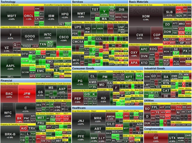
The proposed budget is a very complicated chart to read for a general interpretation, but the following chart is even more mind-blowing. This chart plots the stocks in the fortune 500. The size of the rectangle is the capitalization of the company. Like the previous chart, this is also a heat map in which color represents stock price change. Red stocks are losers and green stocks are winners.
Frankly, I find this chart to be almost unreadable. Too much detail plus duplicate labeling for the largest rectangles complicates interpretation.
For further reading on the construction and interpretation of the mosaic charts, read this lecture on mosaic plot from New Zealand.


